Case study
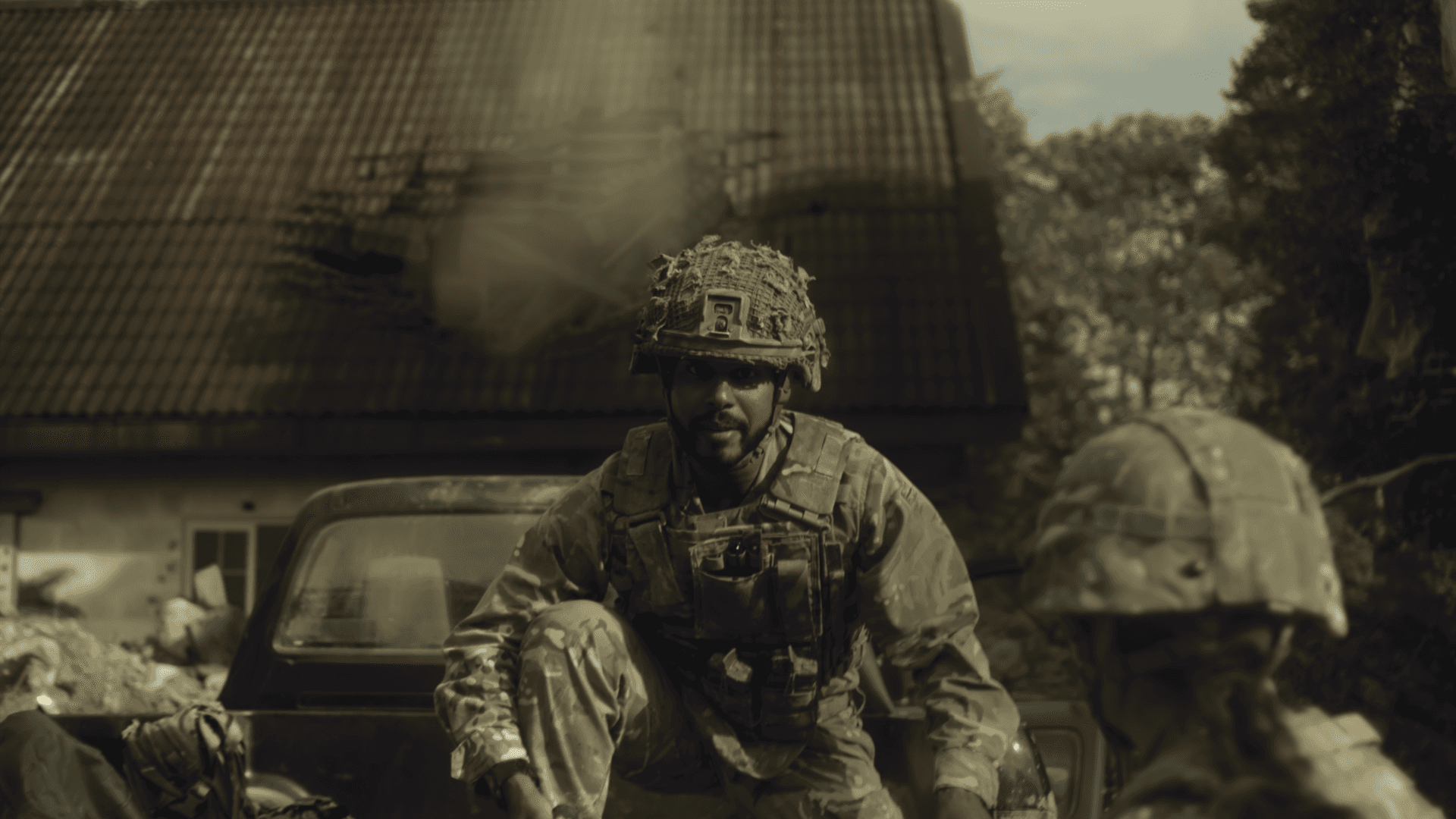
The Army To-Be Candidate Experience
highlights
DELIVERABLES
research playback
intro
The British Army offers over 170 full-time and part-time roles, but the application journey is often overwhelming and confusing for potential candidates. A government-focused research agency (our client) had previously conducted in-depth research that revealed key frustrations during the discovery journey and a significant drop-off in applications.
Our task was to translate these research insights into clear, actionable improvements that would support a smoother, more guided candidate experience. This work presented here is from Phase 1 (completed between April and May 2025). I led this project to identify key friction points in the current experience and propose strategic design responses.
The team
I collaborate with the research agency and the Head of CX in my team.
My role
As the lead UX designer, I defined the future-state candidate journey. I took ownership of synthesising the findings, conducting a deep heuristic review, and designing a guided flow to support user decision-making.
challenges & goals
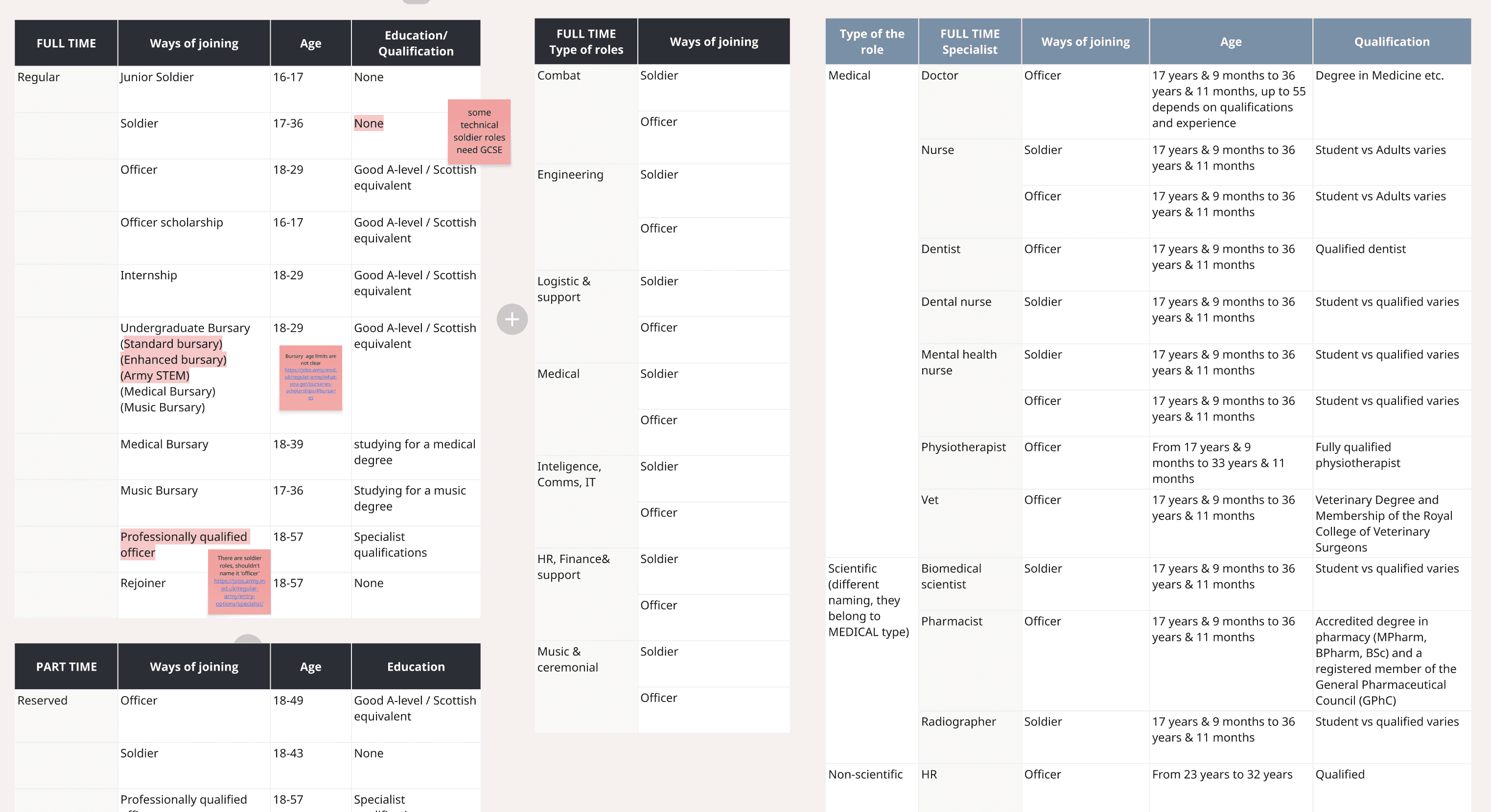
For all the 170 full- and part-time roles across combat, engineering, logistics, medical, IT, and more, each role has distinct entry requirements based on age, education, and fitness. While this variety is a strength, it creates a complex and overwhelming experience for candidates.
Research revealed candidates struggled to understand eligibility, differentiate roles, and find a clear starting point. Information was often hidden or unclear.
Our goal
Surfaces relevant content earlier
Define a clearer “to-be” candidate journey that reflects different pathways into the Army
Reduces cognitive load through better structure
Ultimately increases application completions
the process
To lay the groundwork for a proposed “to-be” candidate journey, I followed a structured approach:
1) Research Synthesis;
2) Heuristic Review;
3) Journey Mapping & Role Entry Analysis;
4) Application Process Review.
1) Research Synthesis
I reviewed existing research to understand candidate pain points and opportunities, focusing on confusion, lack of clarity, and high drop-off areas.

2) Heuristic Review
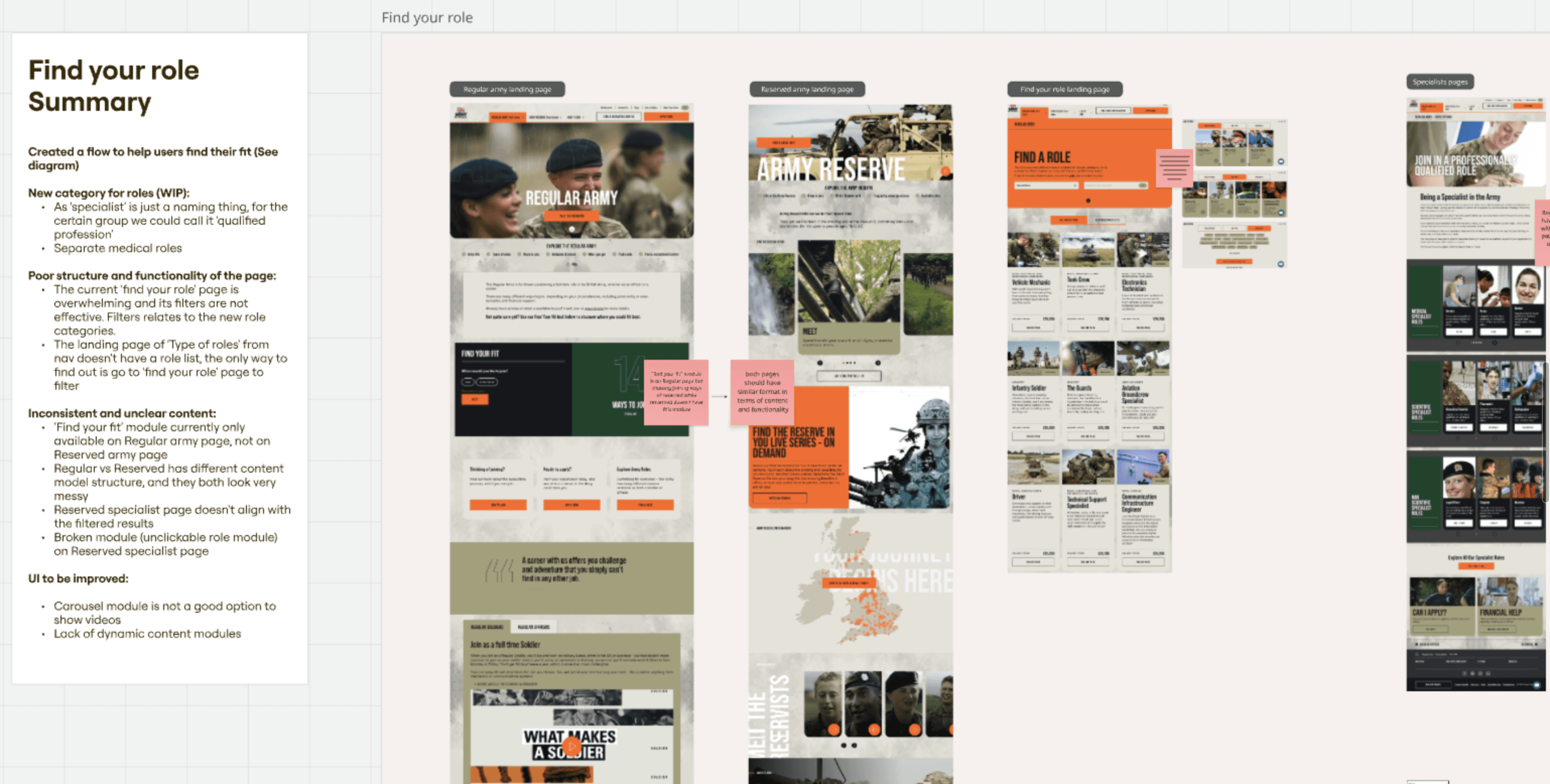
I conducted a usability audit of the Army’s recruitment website which includes assessment of the IA , UX and UI on main touch points, identifying key usability issues and navigation challenges.
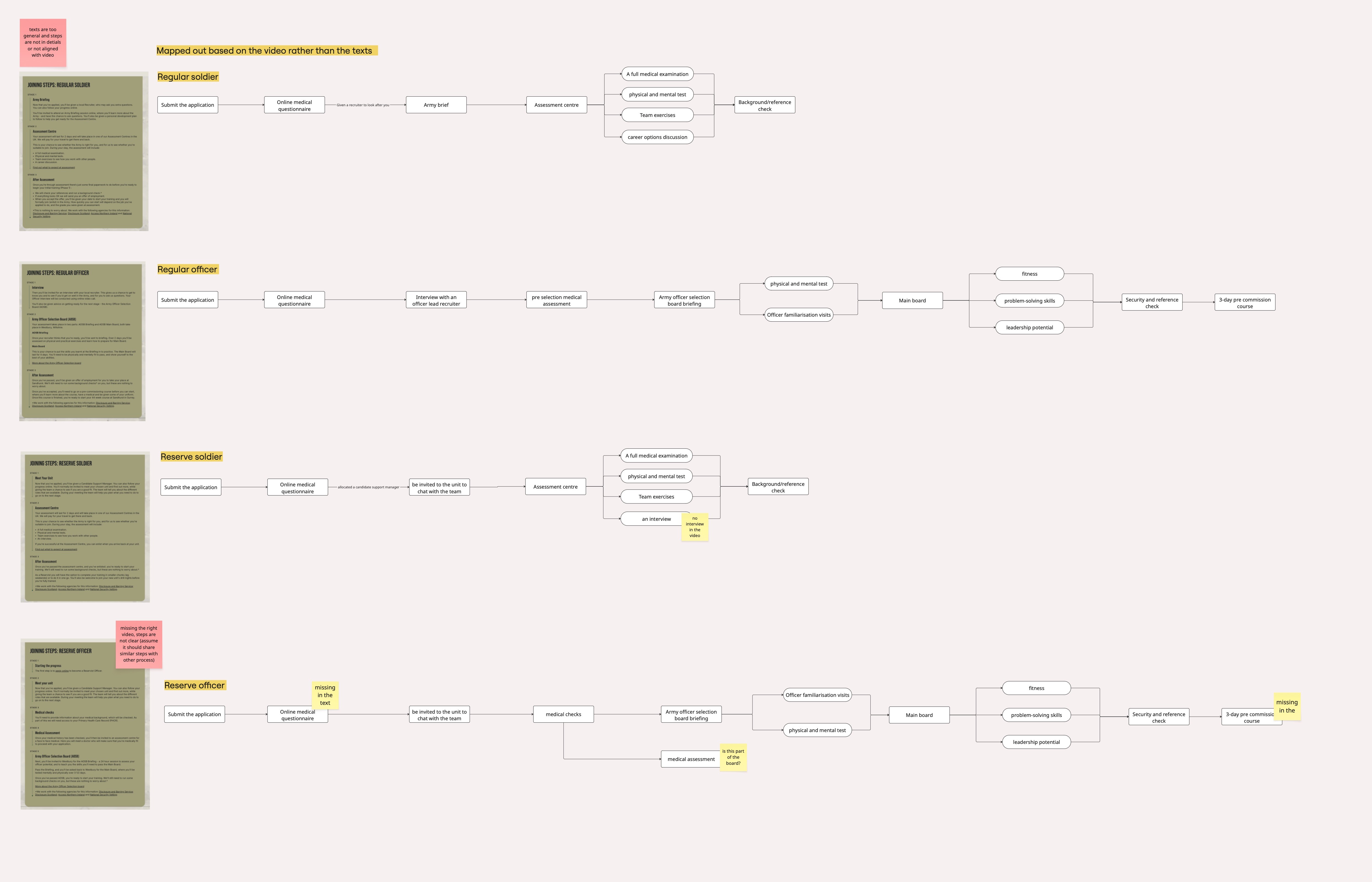
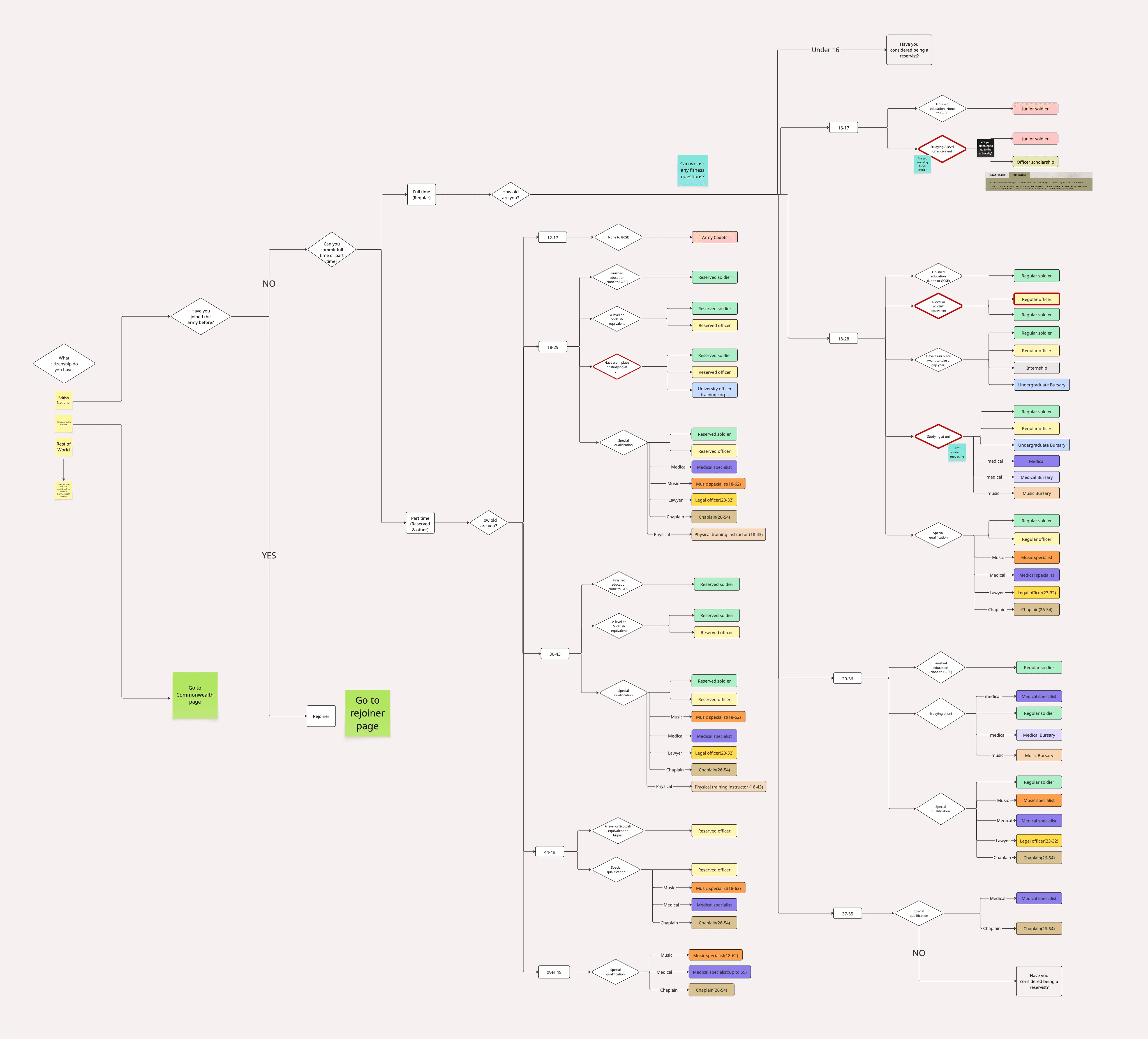
3) Entry Route Mapping
To simplify a complex role structure, I mapped all entry routes and role types, and created a logic diagram that reflects how eligibility factors like age, education, and citizenship influence a candidate’s best-fit route.
then designed a guided flow that uses key eligibility criteria — like age, nationality, and education — to narrow down options.
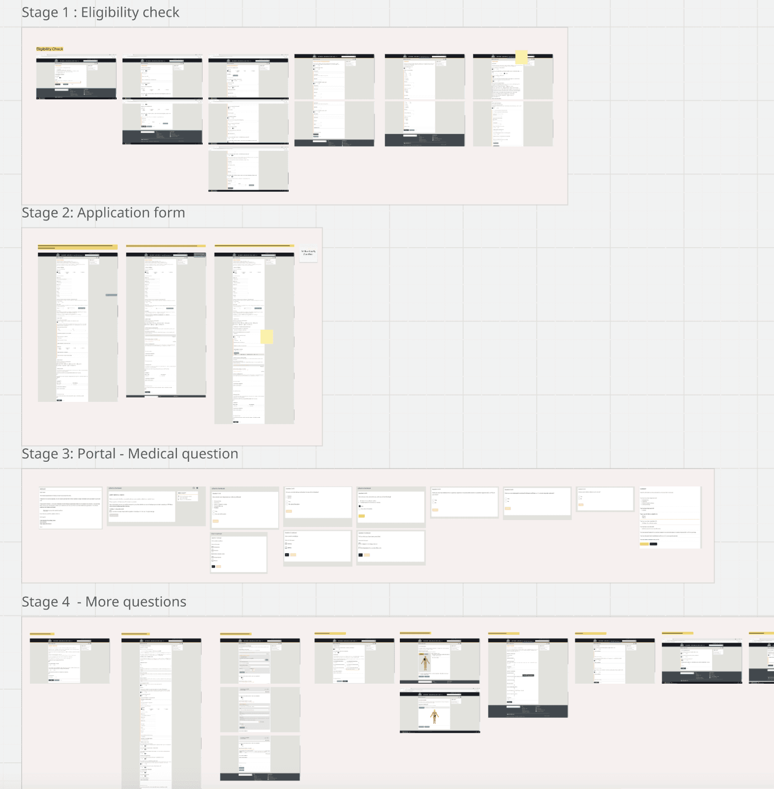
4) Application Process Review
I reviewed the candidate portal and the full sequence from account creation to submission, assessing whether the process structure and language contributed to drop-off.
Delieverables
Our Phase 1 work focused on diagnosing where the current journey breaks down and proposing a clearer, more supportive “to-be” experience.
Key Areas for Improvement
Through research synthesis, heuristic evaluation, and journey mapping, I identified six critical issues shaping the candidate experience:
Confusing journeys and hidden information made it difficult to navigate.
The current Information Architecture made it hard to explore and compare roles.
Page content lacked clear structure, making it hard to scan or understand next steps.
The UI needed clarity, consistency, and overall optimisation.
Role categories and filters didn’t help users narrow down their options effectively.
The application process was long, and questions are unstructured
Key Deliverables
We translated those findings into actionable deliverables, with two central artefacts showcased in this case study:
Content Strategy: Simplifies language and surfaces eligibility details earlier
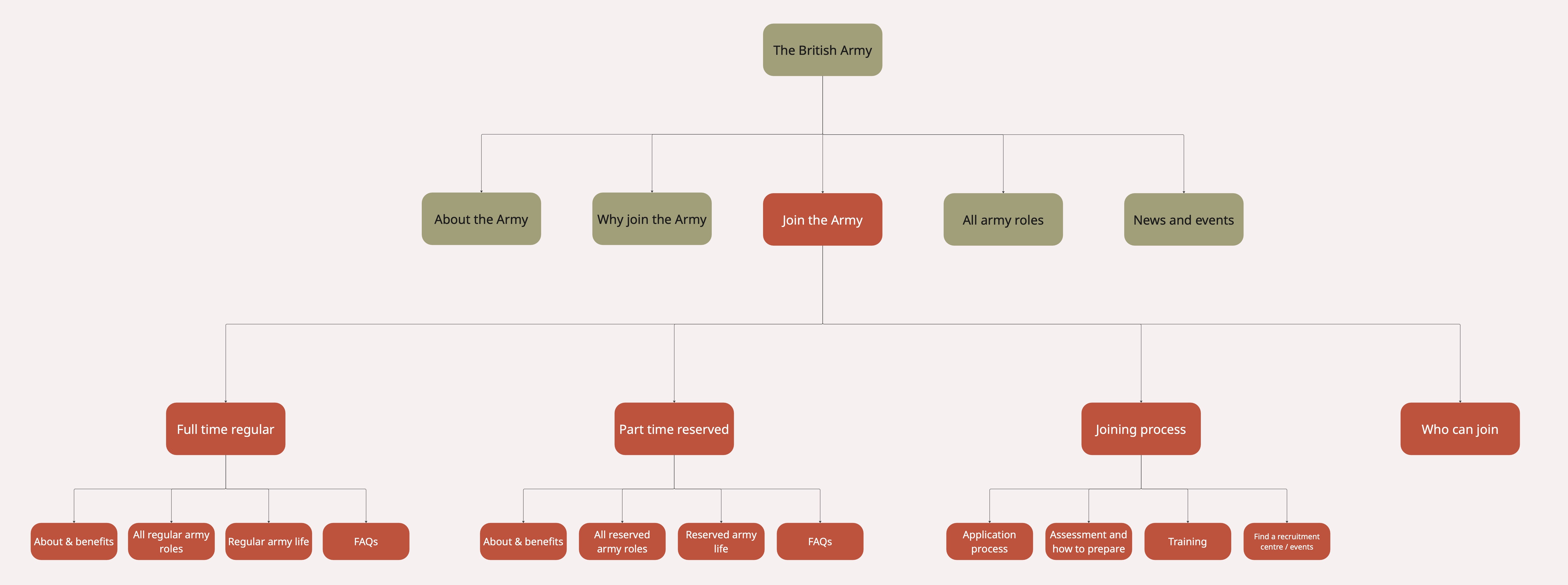
Information Architecture: Reorganises content for clarity and flow
Role Finder Prototype: this shifted the experience from passive browsing to active, logic-based decision-making, helping candidates quickly understand their best-fit paths and key distinctions like full-time vs. part-time or officer vs. soldier.
(The prototype was designed to fit the mobile browser screen for clients to truely interact with on their phone)

New Role Cards: Clearer role previews to support scanning and comparison

Mini Medical Fitness Test: Supports early self-assessment
Personalisation Concepts: Tailors journey paths based on user inputs
Next step
This case study presents a high-level view of the work completed during Phase 1. To maintain client confidentiality, only select examples are shared — focusing on overall direction rather than full detail.
If you’re interested in understanding the specific issues each deliverable was designed to address, or would like a deeper look at particular aspects such as the role discovery logic, content strategy, or application flow redesign, I’d be happy to walk through the full scope in a one-on-one conversation.