Design system
Design System - Agency
Highlights
DELIVERABLES
Web, native (wip)
INTRO
At SQLI, we set out to build a design system that does more than keep things looking sharp—it makes the design process faster and smarter. Working with a small team, I helped structure a Figma-based library of components and templates that adapt easily to different brands using token-driven theming. It’s all about creating consistency without sacrificing creative freedom, whether we’re pitching to clients or building new products.


The goal
Our agency needed a design system that:
Streamlined pitch creation and delivery.
Offered reusable components to reduce repetitive design work.
Was flexible enough to adapt to a variety of brands and product types.
My role
I joined the project as soon as I joined the company, collaborating closely with the team (another product designer and a frontend developer). My responsibilities included:
Restructured the system (Foundation → Components → Modules → Pages).
Audited and refined pre-existing components.
Added new modules and elements from scratch.
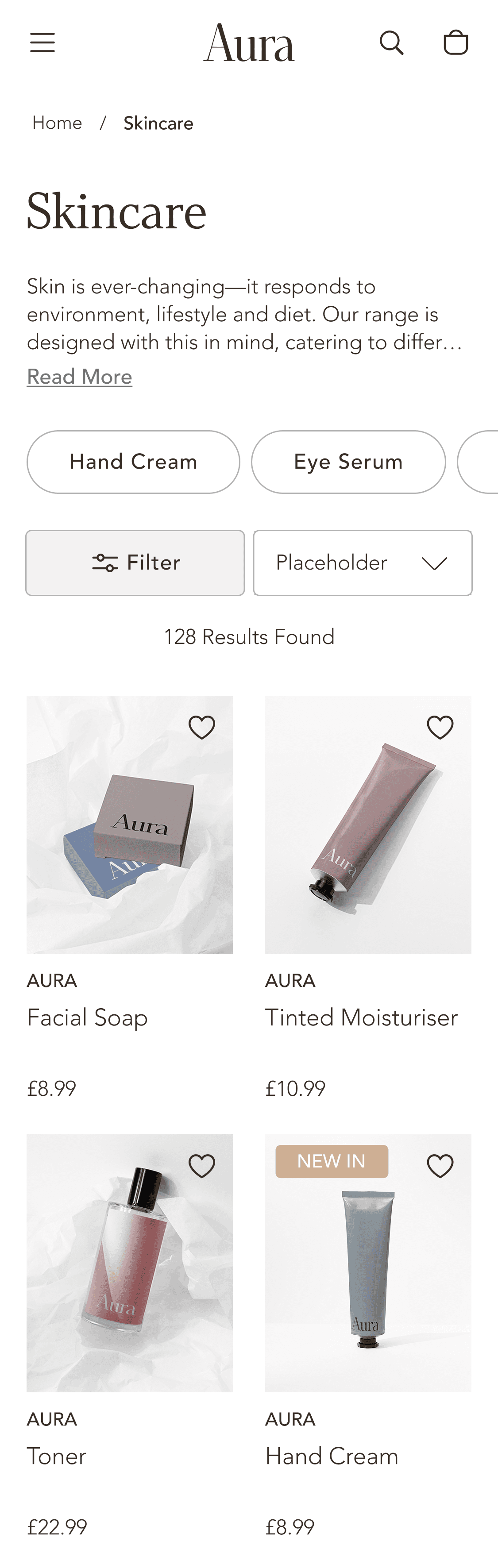
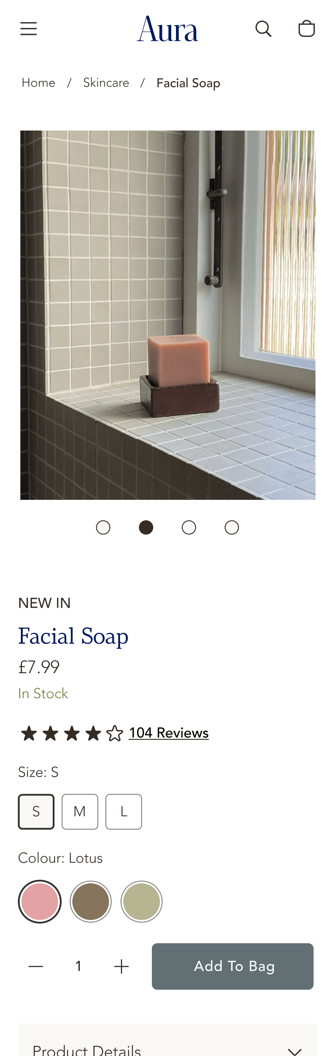
Created a demo brand Aura to showcase the flexibility of our design system - Full brand reskins with new colour, typography, and spacing sets.
Co-led design system development with another designer.

Feature highlight
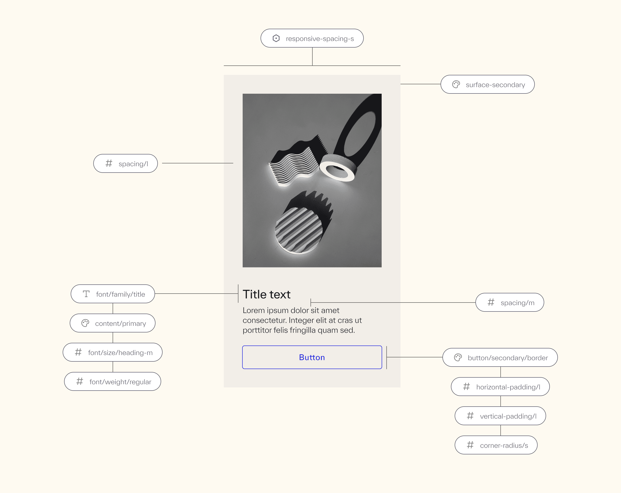
Design tokens are centralized values (colors, strings, numbers) that can be updated once and applied everywhere. In Figma, we use variables to implement them.
Here are the benefits:
Instant theme updates—change one value, see it reflected across all components.
Visual consistency—no more slightly different blues or padding values.
Ease of maintenance and collaboration across teams.

Utilising Figma Variables
We use variables across:
Typography – Font families, sizes, spacing
Colour – Backgrounds, text, borders
Spacing – Padding, margins
Radius – Corner rounding
Breakpoints – Responsive layouts
Language Strings – Consistent button/CTA text like "Add to Cart"


Demo brand
To show the flexibility of our design system, I created Aura, a fictional demo brand used to showcase theme switching. We leveraged design tokens (called variables in Figma) to allow:
Full brand reskins with new colour, typography, and spacing sets.
Support for seamless dark/light mode toggling, seasonal campaigns or sub-brands.
This is great for the following real-world examples:
Barbour/Barbour International colour changes
Groups of brand with sub brands
Christmas or seasonal themes
Holiday or promotional themes.
Dark/light mode & colour themes toggling.

Typography toggling
Module spacings toggling
Impact
The SQLI design system is built to empower designers—not restrict them. It gives designers a head start with ready-made, responsive components that are easy to customize. Built in Figma with accessibility and documentation in mind,
It also speeds up pitches and prototypes, serves as a sellable asset for clients, and scales easily across brands, without limiting creativity.
Next step
We’re now building a native app version, rethinking how tokens and components translate into mobile environments.
If you're interested in my experiences in design systems, happy to share more over a call!