Design system
Design System - Farfetch
Highlights
DELIVERABLES
Web, ios and android
INTRO
As part of my work at Farfetch, I conceptualize, design, and maintain a comprehensive design system that meets global accessibility standards across iOS, Android, and responsive web. In this project, I present two case studies—one for iOS & Android and one for web—that showcase my end-to-end process of creating and optimizing components. Both components are currently live and fully integrated into the system.
Framework
At Farfetch, we have a robust design system that improves team efiiciency while ensuring accessibile experiences for all users.
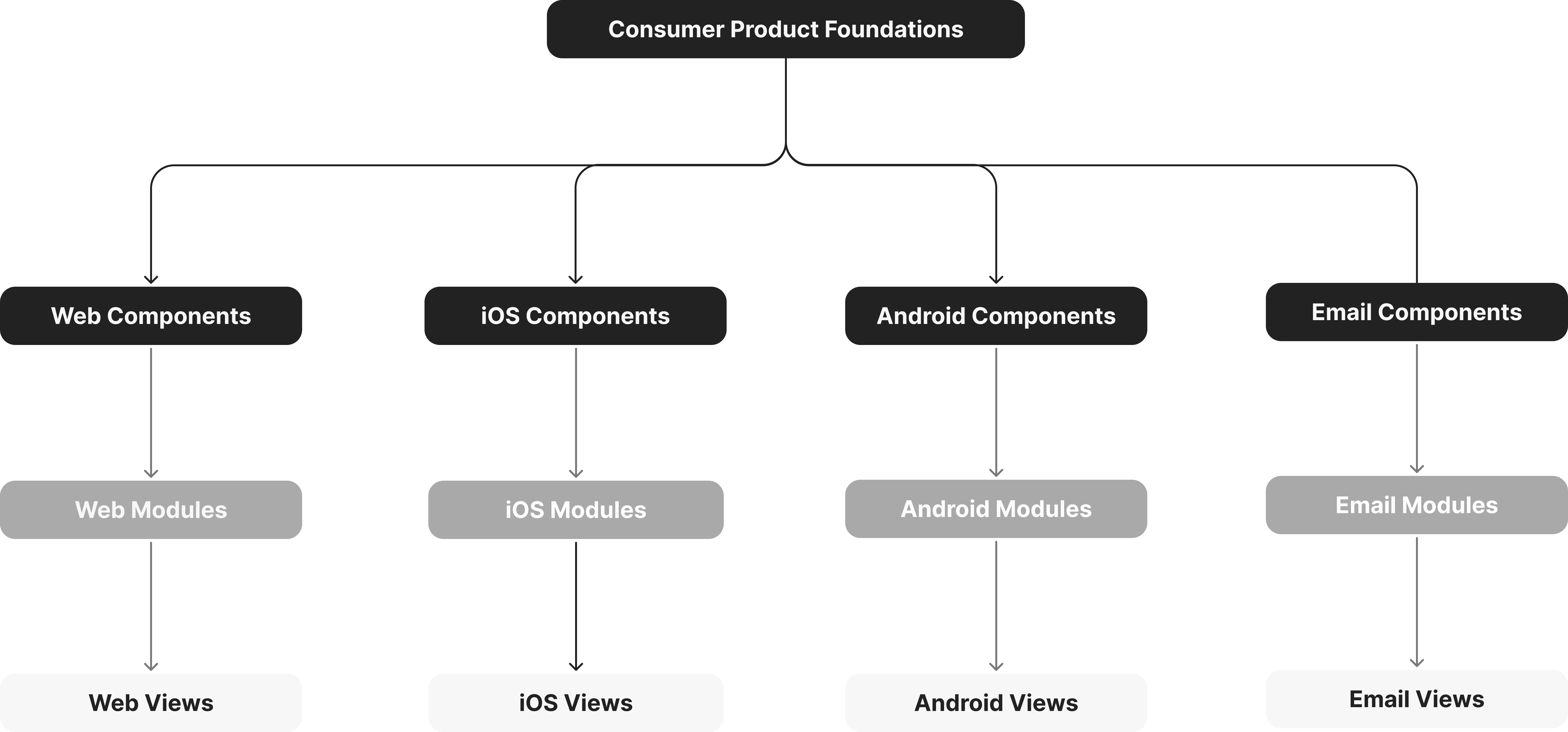
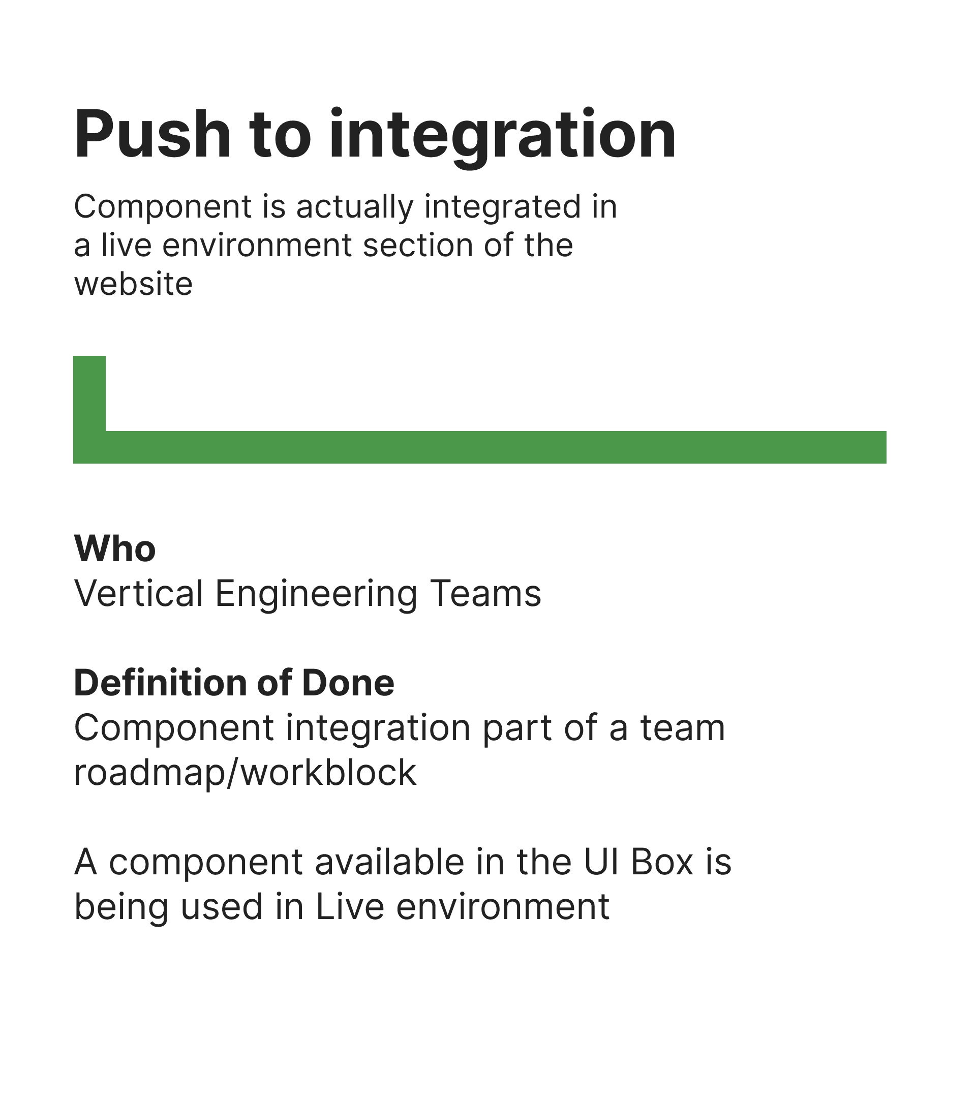
Contribution mode
ANY team can contribute to the DS components library, as long as following the workflow.


Case study 1 - nATIVE (live)
The business requires a sale landing page for the Beauty department, but with limited time and scope, there's no room for layout changes. Although we initially planned to mimic the Fashion department's experience, I discovered that the pre-existing live landing page used outdated components not in our design system. Therefore, before creating the Beauty sale landing page, it's crucial to develop a Sale Card component to replace these legacy components and align with every sale experience.
The Legacy Pages

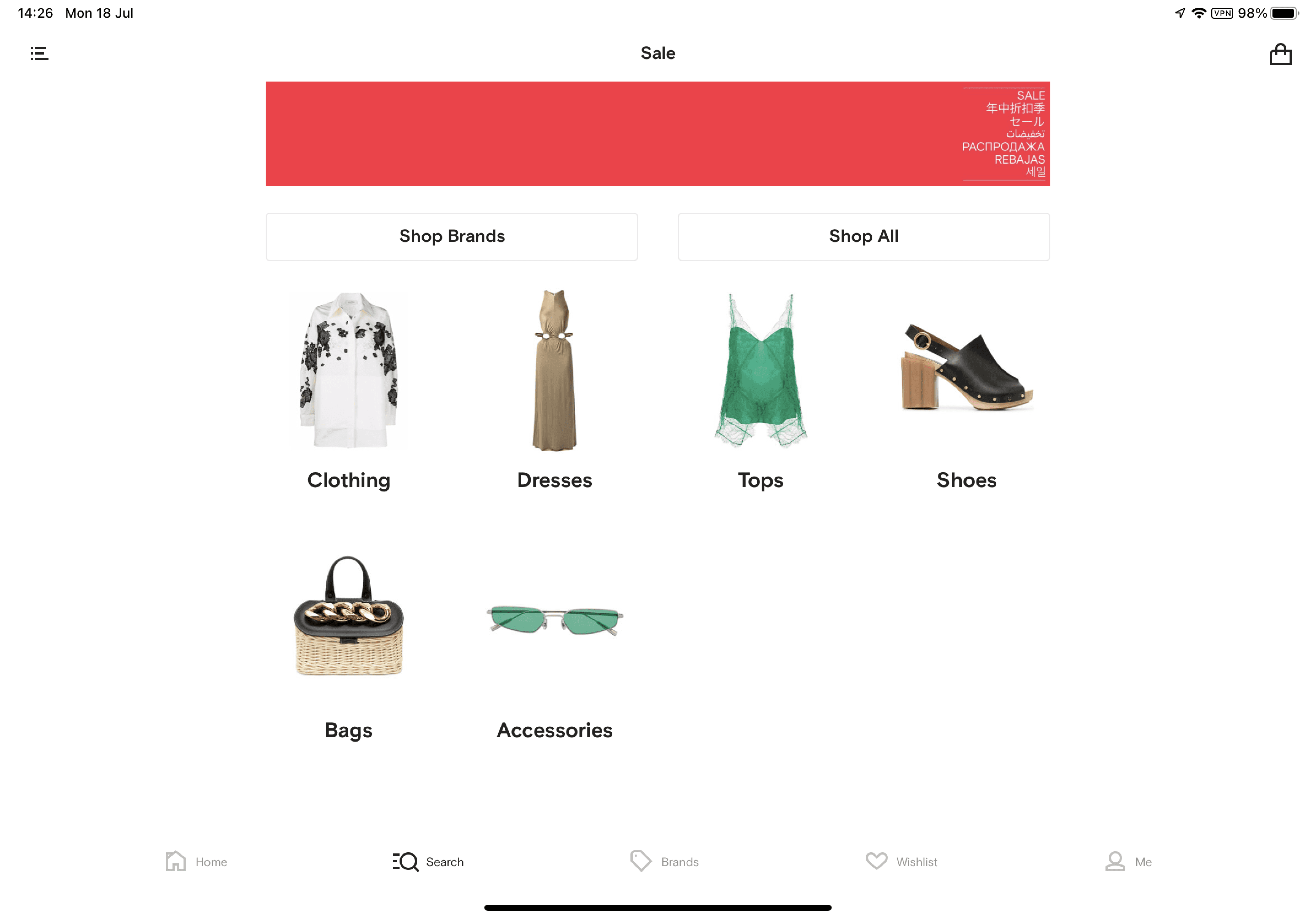

Live page now

The Component
For this component, I created -
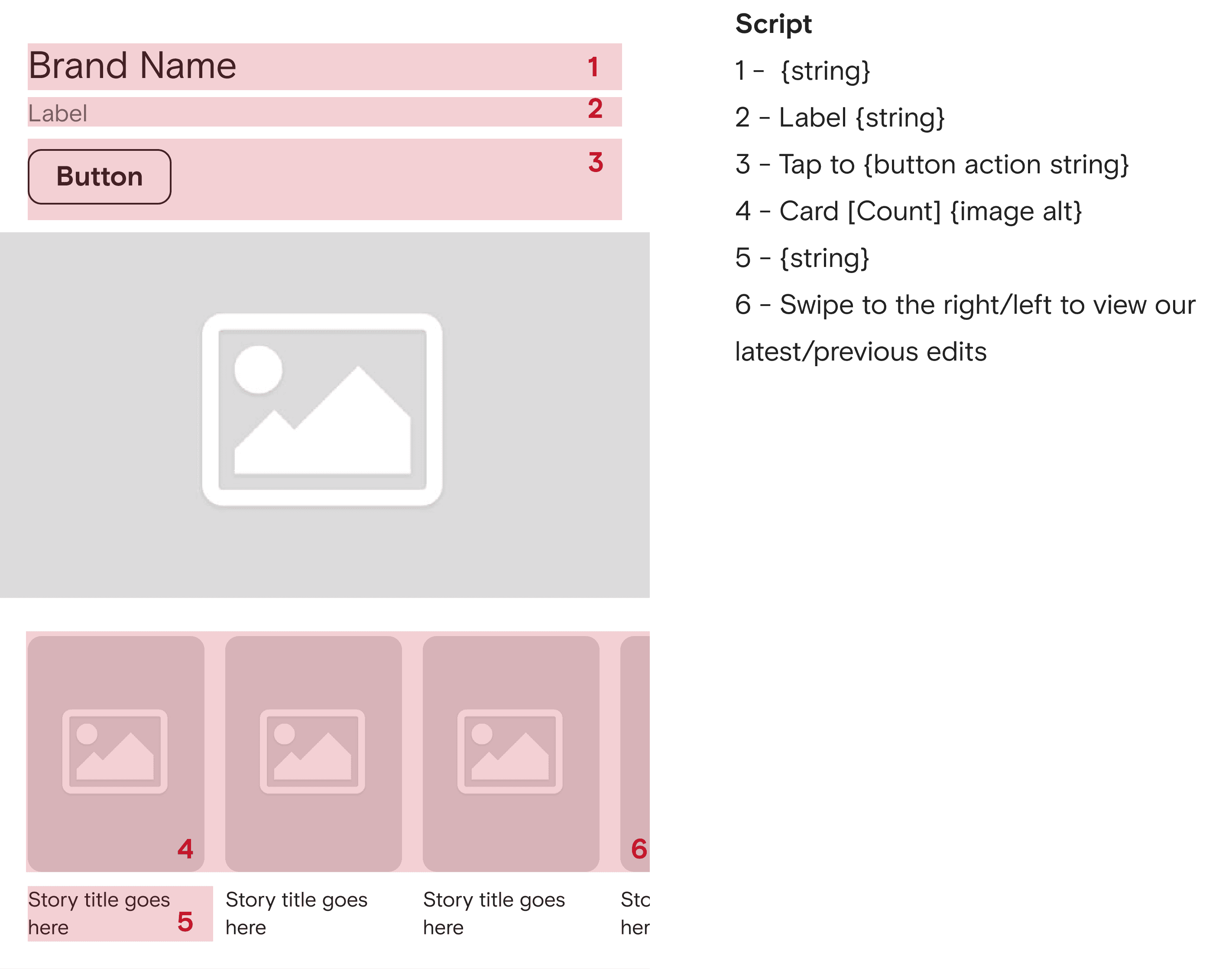
Anatomy
Skeleton
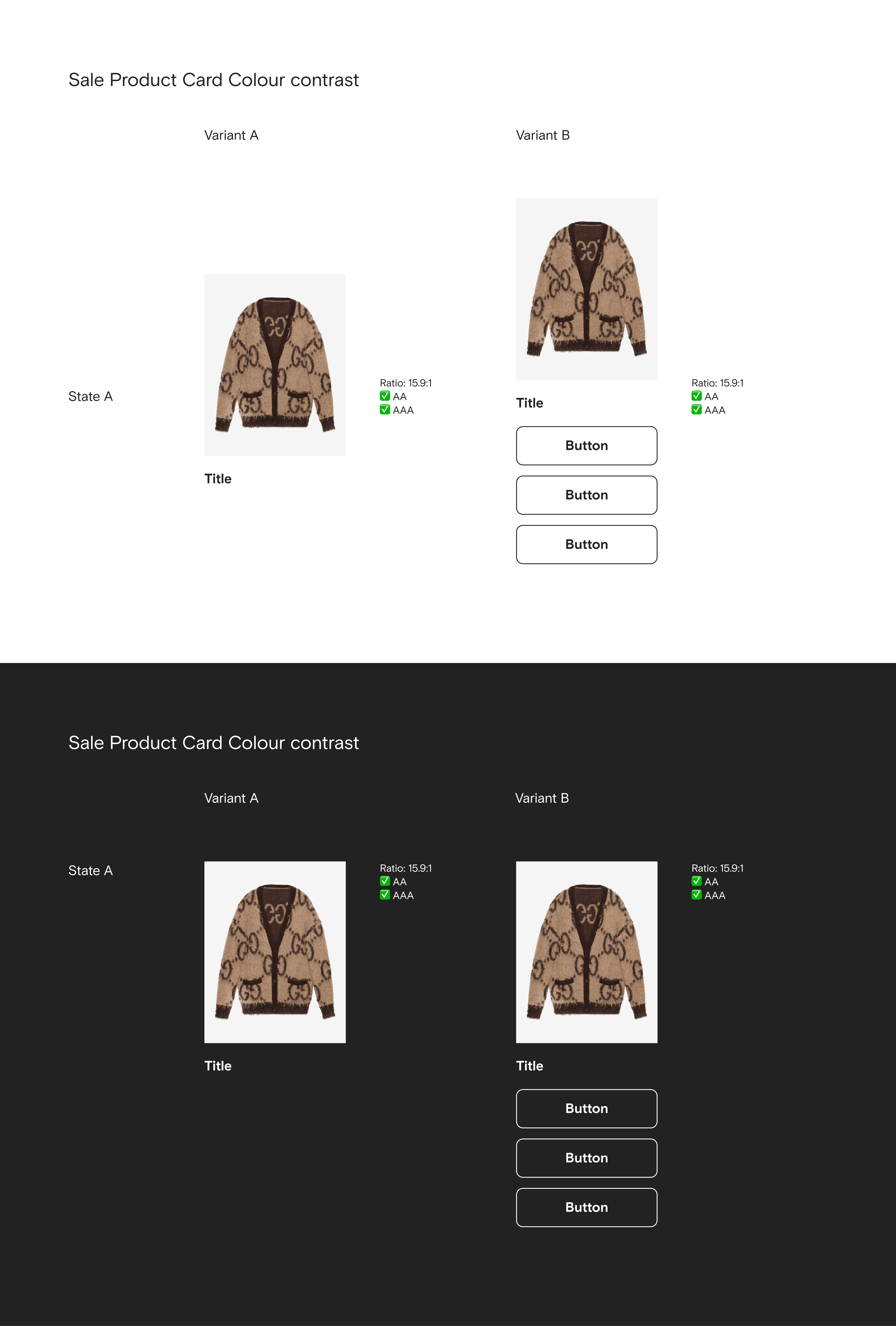
Colour contrast
Voice over
State
Dynamic
iPhone ratios
iPad rations
Anatomy

Skeleton

Colour Contrast
Voice over
State

iPhone ratios
iPad ratios
The Pages
Developed dark mode;
Replaced legacy buttons;
Added "shop by category" ;
Proposed new card component;
Redesigned the bottom entry point for other departments;
Made modules responsive on iPad.
Before
After

Before
After

iPhone ratios

iPad ratios

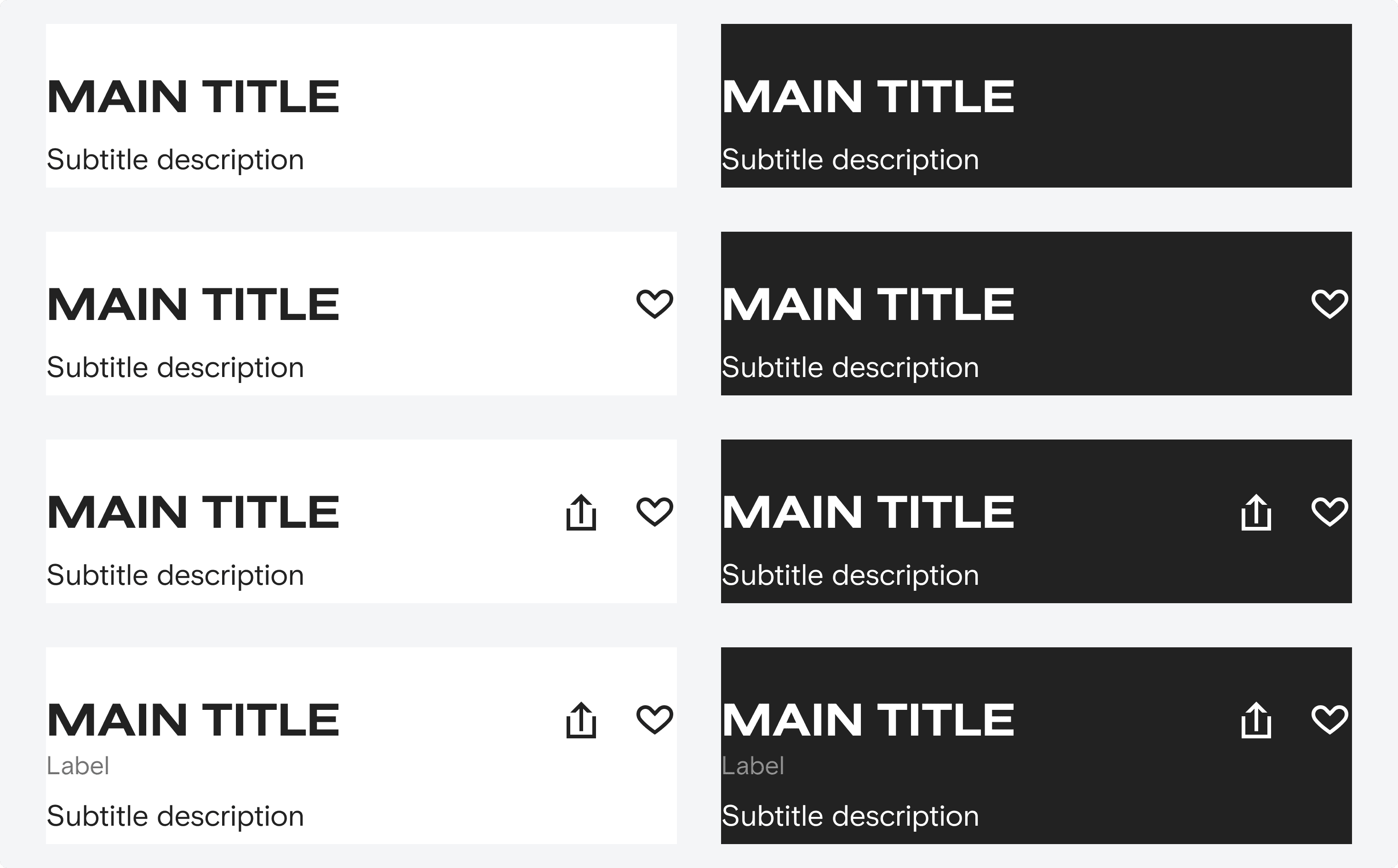
CASE STUDY 2 -WEB (live)
Our previous text overlay experience is heavy and doesn't feel very 'luxury'. To improve the text overlay for WEB experiences, an important thing to keep in mind is accessibility - colour contrast. This new linear is now applied across all Farfetch platforms.
Component Iteration
During the exploration, I started with the smallest breakpoint and applied different linears, trying to push the boundaries to make the linear as light as it can be, while remaining conscious of colour contrast.
After a quick user testing for UI elements, I came up with the new linear.
Before
After

A glimpse of the exploration

The new gradient

Specs for new components and modules
Alongside the new linear, I proposed a new 'Editorial Card' component for a content initiative and updated all relevant modules to align with the new linear system.
Here are some details —
The new 'Editorial Card'

Variants

Portrait 3:4 for mobile
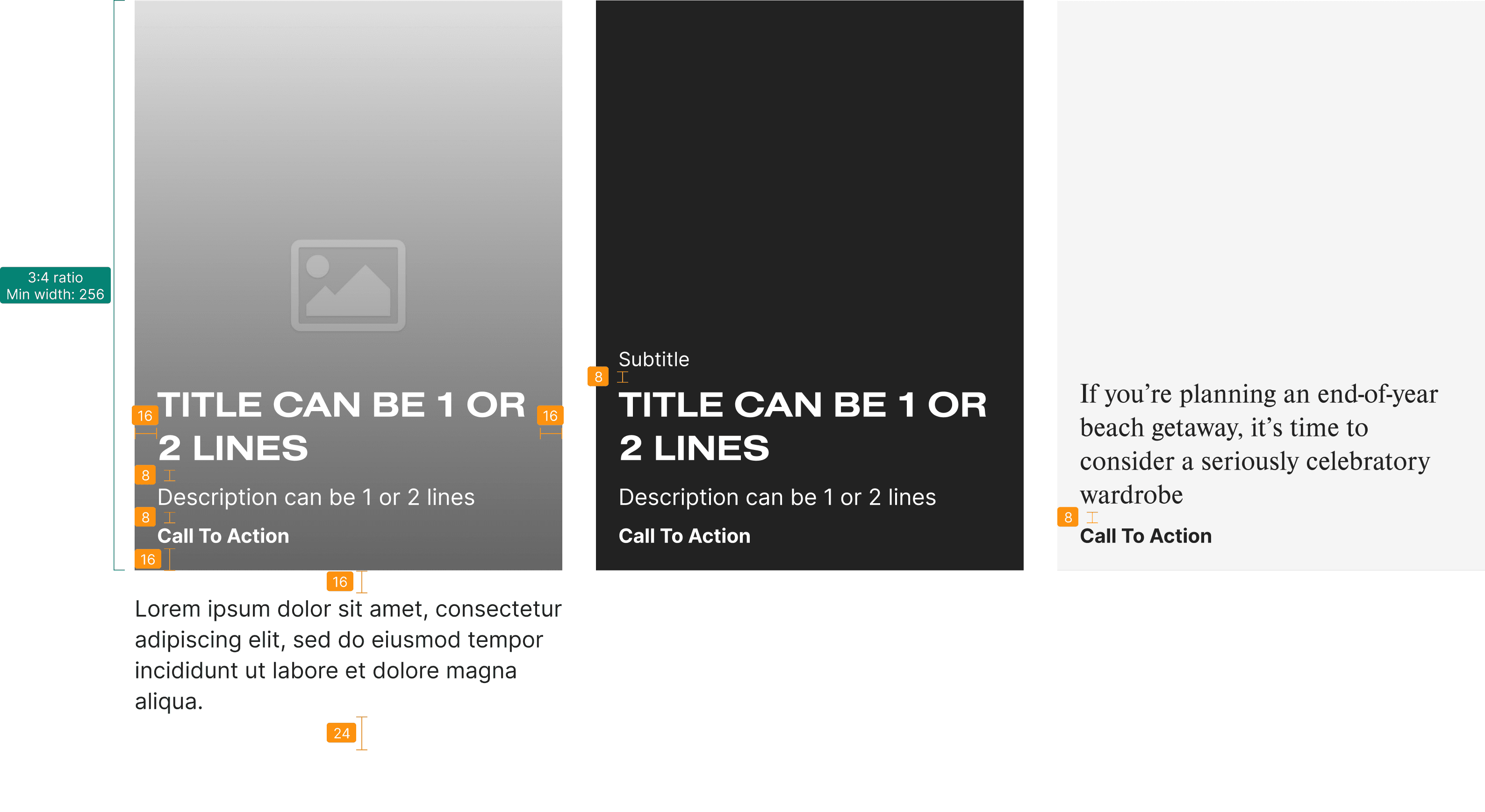
Portrait 3:4 for desktop

Landscape 147:101 for desktop only

MY ROLE
I have contributed to Farfetch's system throughout my work. Here are other different snippets of some of the components and modules that I've worked on.
Variants of responsive Web modules

Documents for guidlines

Dark mode for mobile
Hover state for Web
Voice over for mobile
Hover state for Web

Collaboration
Working on design systems involves more than crafting UI and documenting guidelines – it’s about aligning design principles with business goals and user needs. To optimize content modules with the new text overlay experience, I collaborated with designers and marketing to address various use cases.
If you're interested in my experiences in design systems, happy to share more over a call!