Case study
Connecting Customers with Brands
highlights
DELIVERABLES
Web & ios
INTRO
We developed a new Brand Header for product listing page that communicates each brand’s identity and promotes an emotional connection with customers. This project shows how I craft UI solutions to address business challenges effectively, followed by some blue sky ideas of content modules that I created during multiple design sprints.

BUSINESS REQUIREMENT
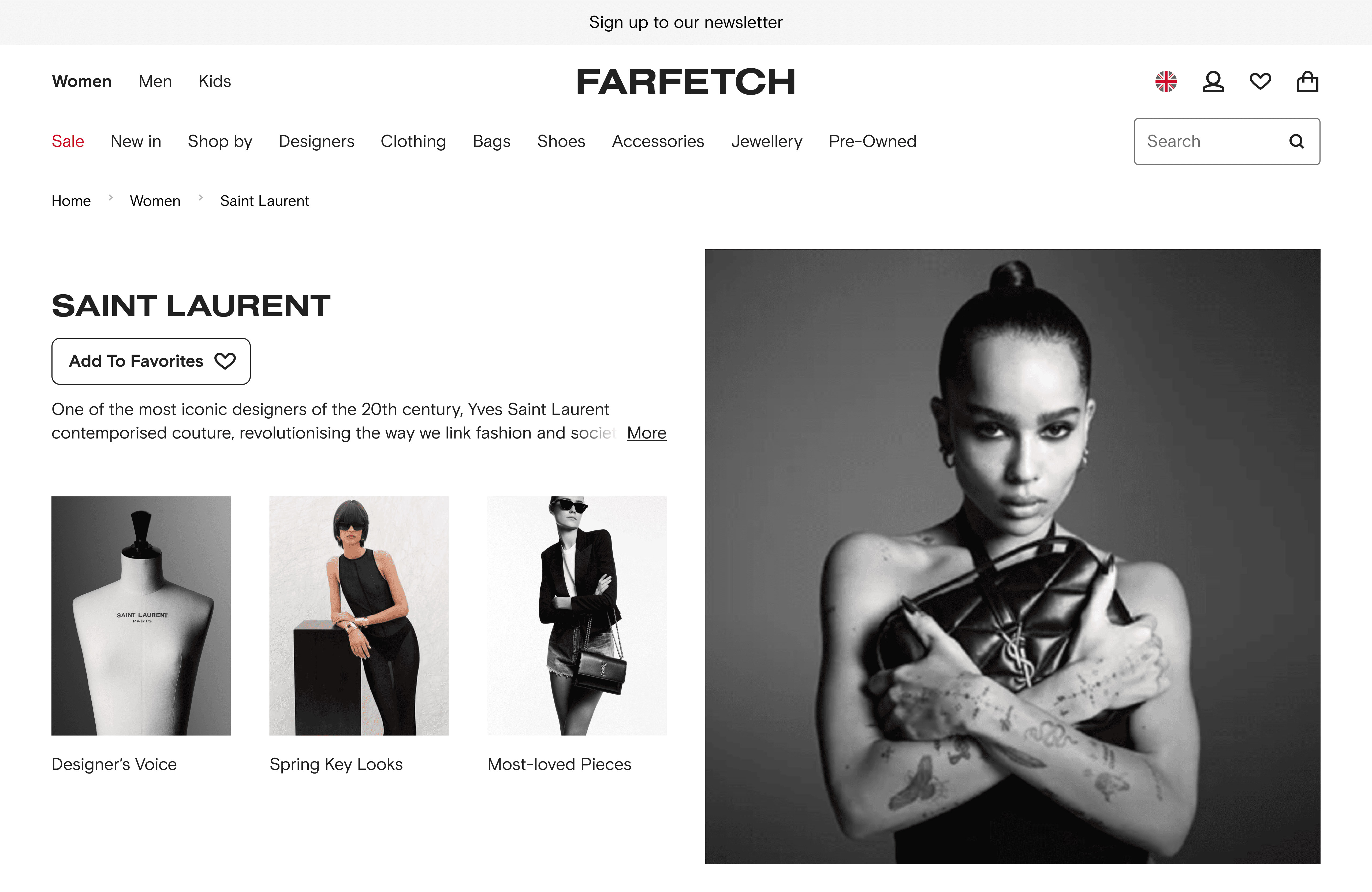
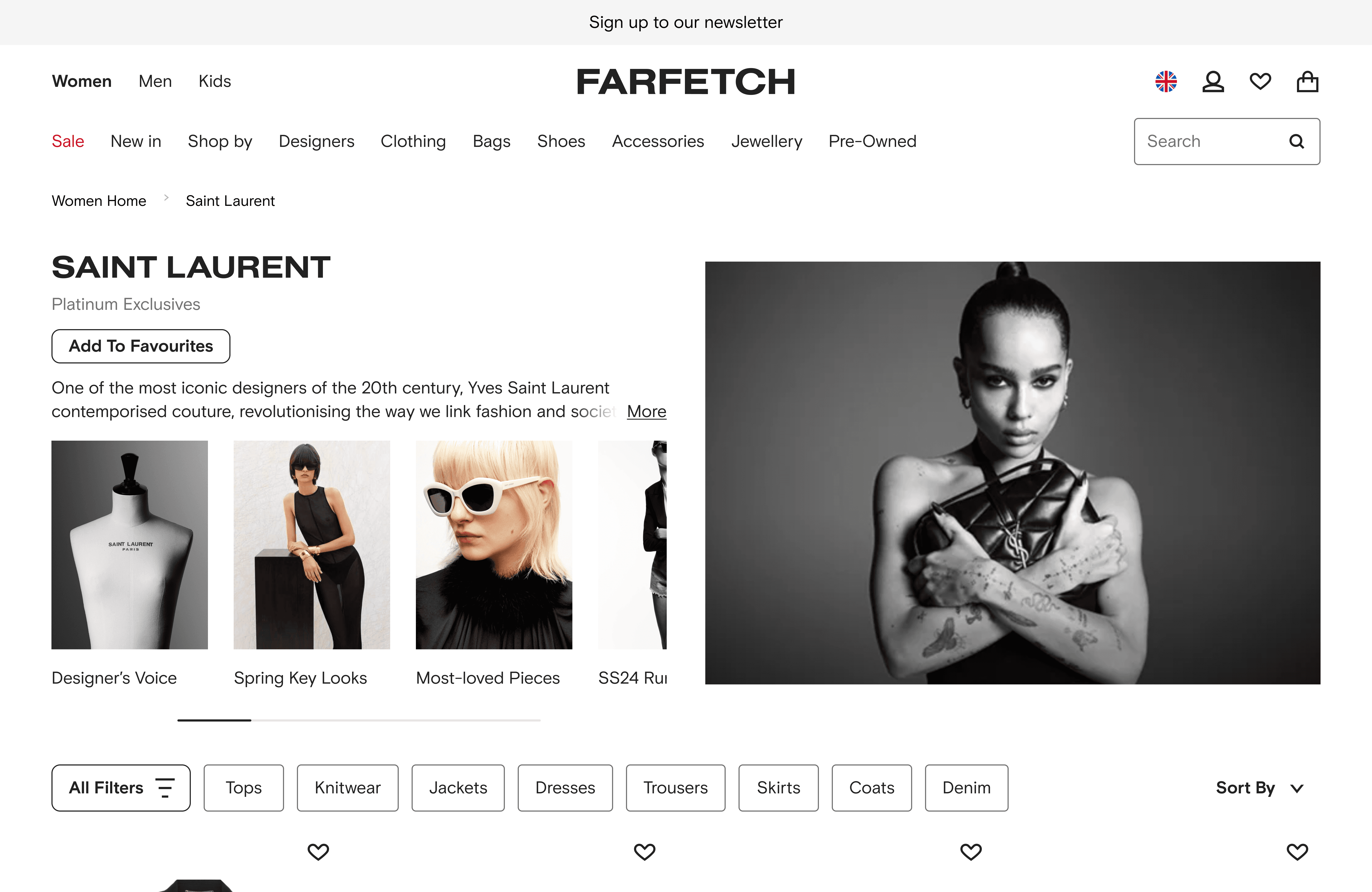
As part of the Richemont Enterprise Programme, FARFETCH Marketplace gained e-concessions to onboard a wide range of Richemont Maisons. Currently, FARFETCH Marketplace offers a standardized experience for all Brand Partners, limiting their ability to express individual values. Our goal is to create a shop-in-shop experience that empowers Brand Partners to convey their distinct identity through visual, curated, and contextually relevant storytelling.
We have the following full version of our customer user journey based on our new engaging brand experience. My focus is on the Brand Product Listing Page (PLP) touchpoint.
business goals
To develop a new Brand Header for product listing page that communicates each brand’s identity & promotes an emotional connection with customers;
To increase engagement with Branded-products, as measured by the number of Branded Product Description Page visits (in-session)
customer needs
Based on the user testing results and customer insights I collected through multiple content initiatives, one thing I found particularly interesting is that users 'complained' about our product listing pages and noted a distinct 'lack of magic'- most of them would rather just shop on the brand's site. I identified the potential here to make our page's content more dynamic to excite and inspire customers to shop on our site, as well as to let brands speak their stories.
the team
I spearheaded this project from the very beginning to its 2nd iteration. During the process, I crafted UI designs according different stakeholders' requirements and business needs, as well as working closely with engineers due to its multiple variants.
Collaborate with: designers in the workshop (ideating); experience and platform product managers; marketing team; editorial team; creative team; engineering team.
DISCOVER AND DEFINE PROBLEMS
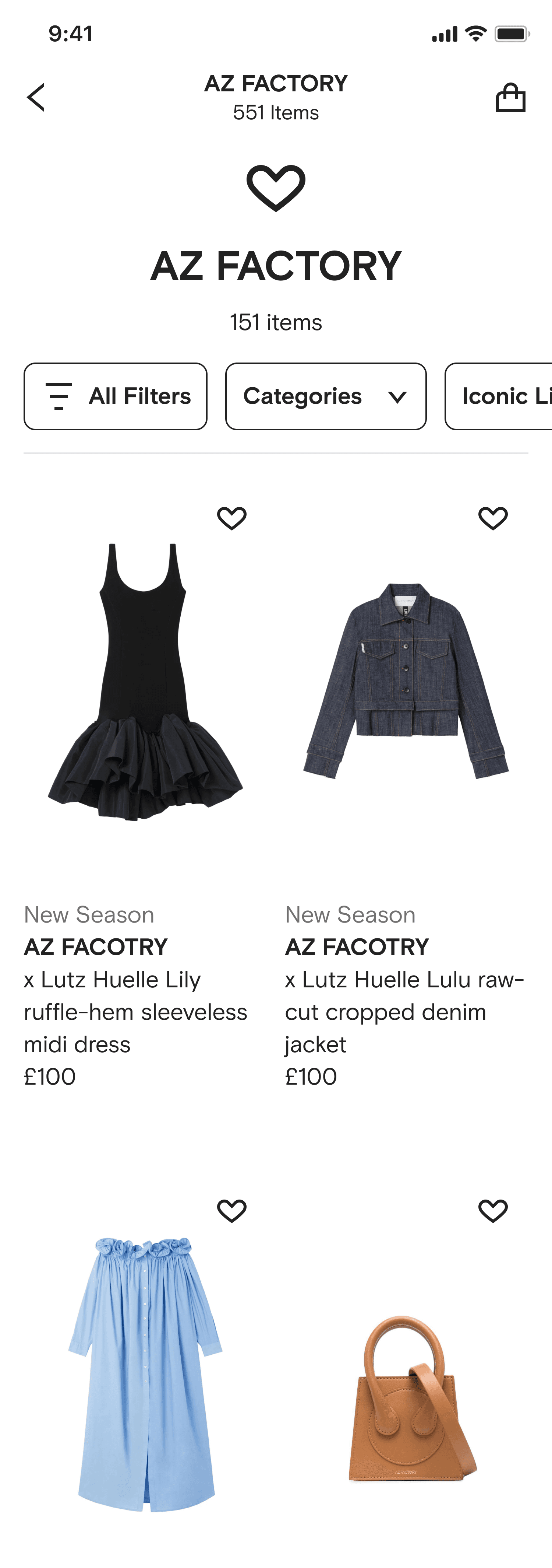
During the Richemont Design Sprint, we came up the idea to add a versatile module that can carry more storytelling content — imagery, text, the brand logo, visually-driven navigation, as well as creating different variants to cater different brand's needs.
business strategy
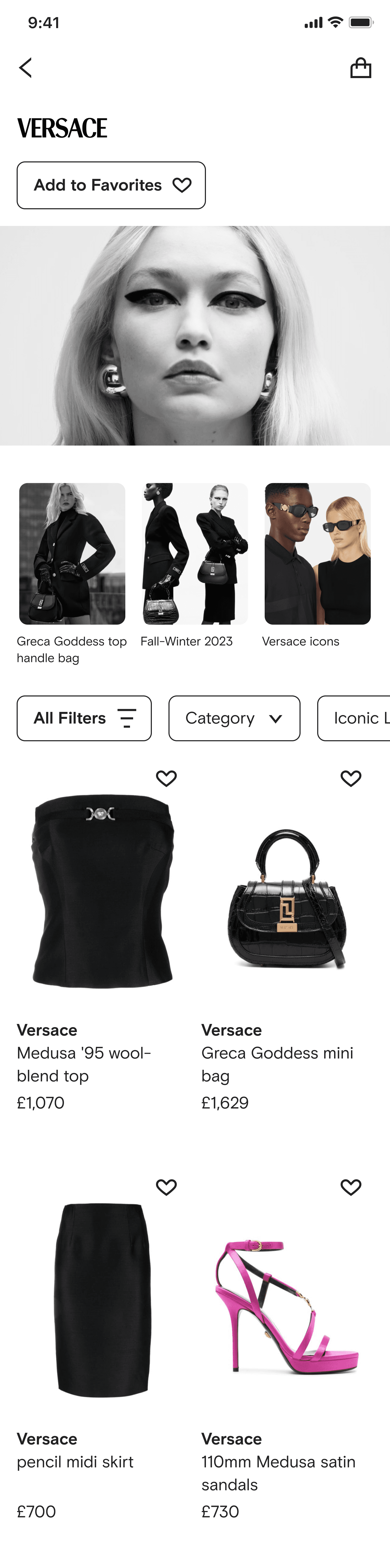
To better support the marketplace and the brand principles, the business conducts a tiered approach to a brand positioning package. The brands in the market place are four tiers which have different features of branded header :
Tier 0 Feature:
Brand logo
Brand intro
Brand image
Editorial image thumbnails

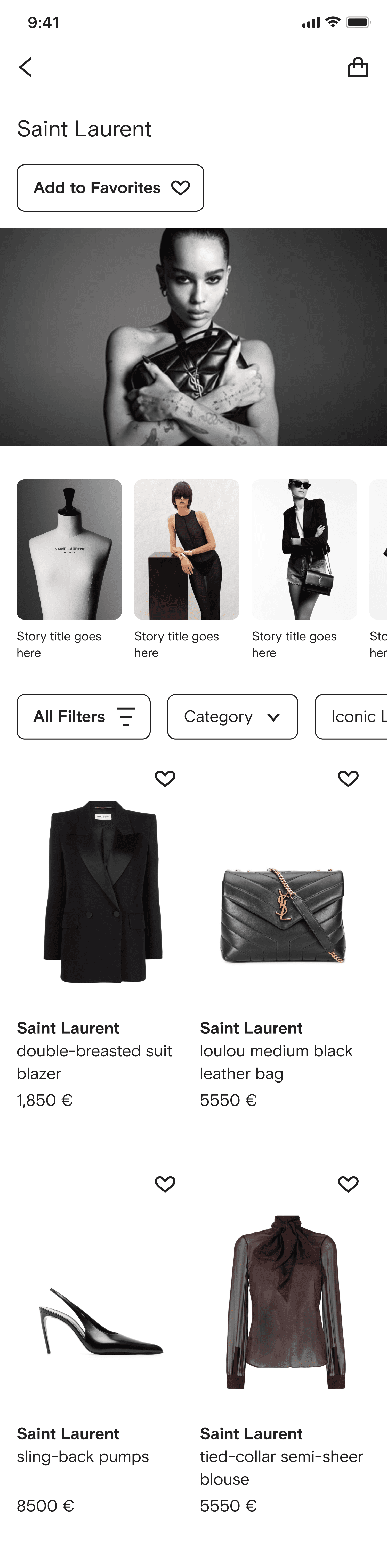
Tier 1 Feature:
Brand name
Brand intro
Brand image
Editorial image thumbnails

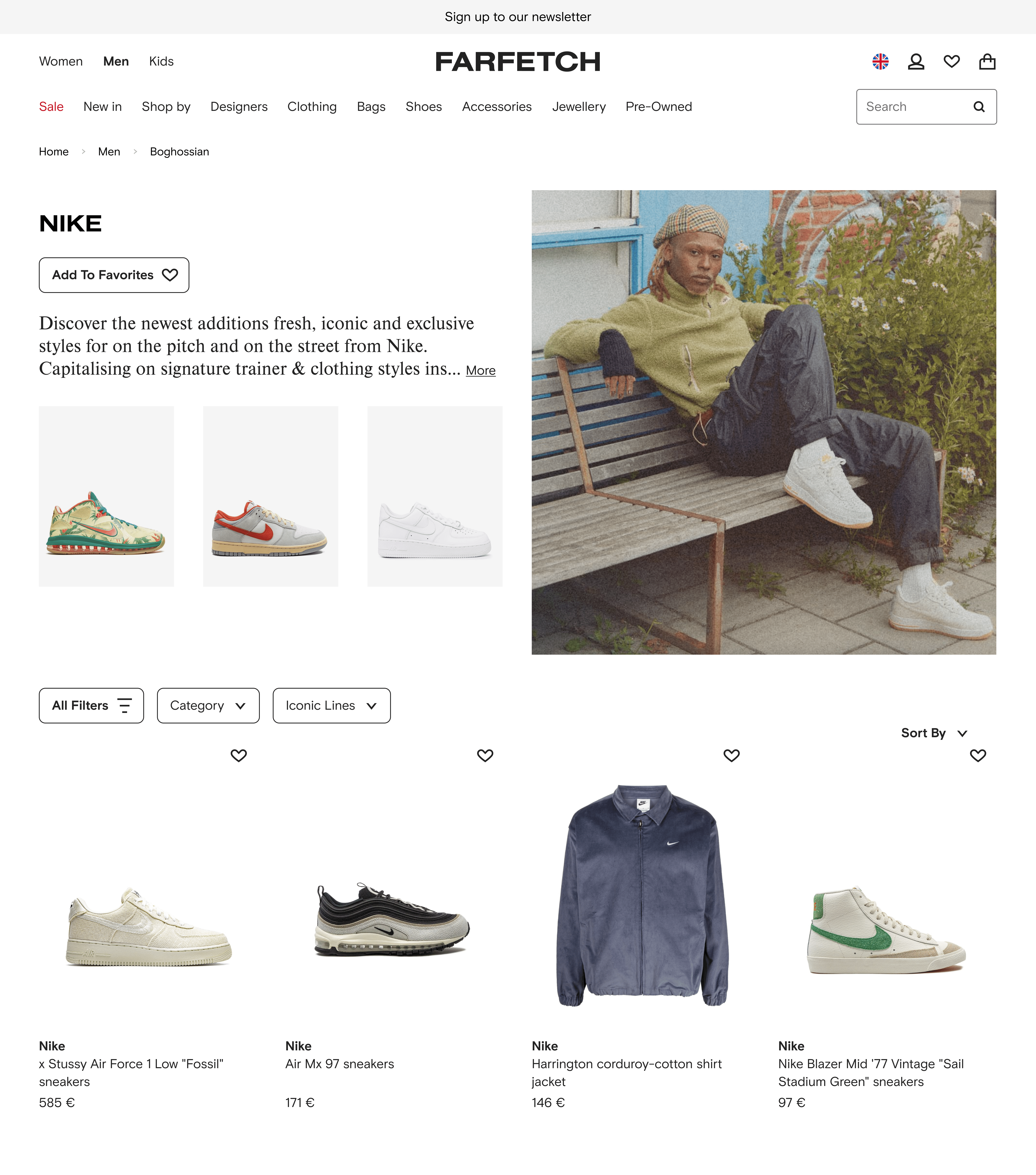
Tier 2 Feature:
Brand name
Brand intro
Brand image
Product image thumbnails

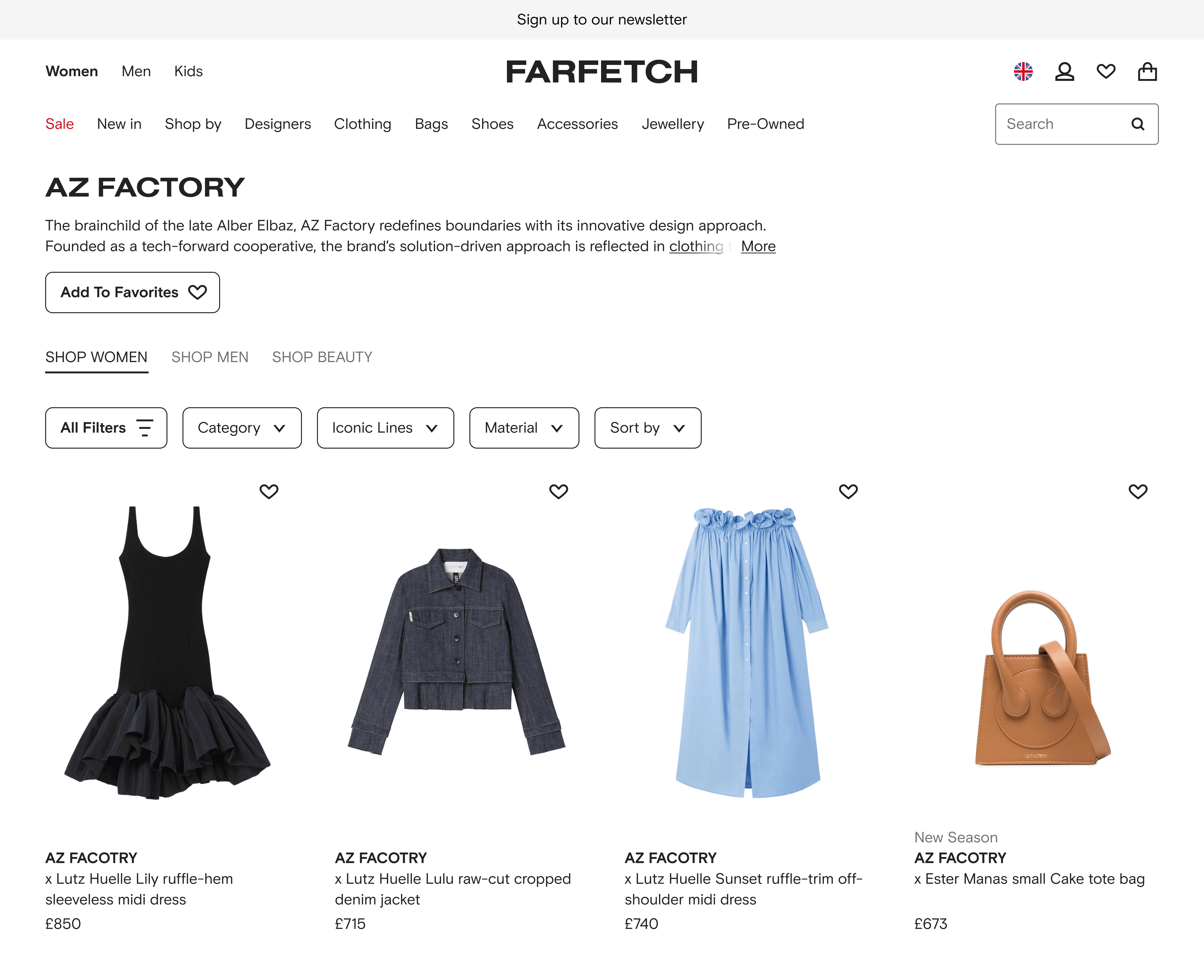
Tier 3 Feature:
Brand name
Brand intro
testing and iteration
In the A/B testing, visitors exposed to the branded header showed:
Web
Engagement rate with PDPs after visiting the PLP %
+17%
Visits to the PDP %
+14.5%
Orders driven through the Branded Header variation %
+11%
OC/GTV %
-9%
ios
PLP engagement rate %
+1.26%
OC/GTV %
-2.73%
OC: Order Contribution
Iteration 1
The negative impact in OC/GTV shows there's a need to improve the Branded Header's performance. Our assumption is the module occupied to much space that the customers were unable to see the products. The challenge is that how to craft the UI while adapting to a new business requirement : adding an exclusive label for brands. Here are my decisions :
WEB key changes
changed the image ratio;
changed the button size to small;
reduced the margin between frames;
created carousel for thumbnails.
Before
After
iOS key changes
changed the button size to small;
reduced the margin between frames;
removed the brand image.
Before

After

the challenge and Next step
A deep dive analysis for both Web and iOS is conducting by the data team to dig into the problems.
As this module is using the Header component in our design system, how to add the Exclusive Label to the Header while adapting to different brand's logo is a challenge. If you're interested to know more on the learnings and iterations in terms of different variants on different breakpoints, let's arrange a call so that I can be sure I'm not breaking any NDAs by publicly sharing things online.